
Shading and coloring are what transform flat digital art into something that feels alive and three-dimensional. It’s the difference between a simple coloring book page and a piece that makes people stop scrolling. Learning how to shade digital art properly helps you add depth, mood, and realism while bringing your ideas fully to life on the screen.
If you’ve ever wondered how artists choose colors, create smooth transitions, or make light feel believable, you’re in the right place. This guide breaks down how to shade digital art step by step, from picking the right color palette to blending like a pro.

When you learn how to shade digital art and combine it with strong color choices, you create artwork that’s compelling and professional.
Part 1: How to Color Digital Art
Before you can shade effectively, you need solid base colors. Let’s start with the coloring process.
Understanding Color Basics
You don’t need to be a color expert, but understanding a few fundamentals helps:
Color Harmony Schemes:
- Complementary: Colors opposite on the wheel (red/green, blue/orange). High contrast and energy.
- Analogous: Colors next to each other (blue, blue-green, green). Harmony and calm.
- Monochromatic: Different values of one color. Sophisticated and cohesive.
Warm vs Cool Colors:
- Warm colors (reds, oranges, yellows) feel energetic and close
- Cool colors (blues, greens, purples) feel calm and distant

Choose Your Color Palette
Start by selecting 3-5 main colors before you begin. This keeps your artwork cohesive.
Methods for choosing colors:
Use Reference Images: Find photos or artwork with colors you love. Use the eyedropper tool to sample colors directly.
Limit Your Choices: Beginners often use too many colors. Stick to a small, intentional palette.
Consider the Mood:
- Bright, saturated colors = energetic, happy, playful
- Desaturated, muted colors = serious, calm, sophisticated
- Dark colors = mysterious, dramatic, moody
- Pastel colors = soft, gentle, dreamy
Block In Base Colors
Use a hard brush to fill in solid, flat colors. Don’t worry about shading yet, just pure color.
Tips:
- Create a new layer for each major element
- Work from background to foreground
- Use the paint bucket tool for large areas
- Keep colors on separate layers for flexibility
See these techniques in action! Check out our sports sticker shop, every design made digitally by us.
Part 2: Understanding Light Sources

Before you add shadows, you need to know where your light is coming from. The light source determines everything about how to shade digital art effectively.
Choose Your Light Direction
Your light can come from:
- Above (like the sun at noon)
- Side lighting (dramatic and dimensional)
- Below (spooky or unnatural feeling)
- Behind (backlighting/rim lighting)
- Front lighting (minimal shadows, flatter)
Most beginners choose top-left or top-right lighting because it feels natural.
Pro tip: Start with one light source. Multiple lights create complex shadows that can confuse
Types of Shadows
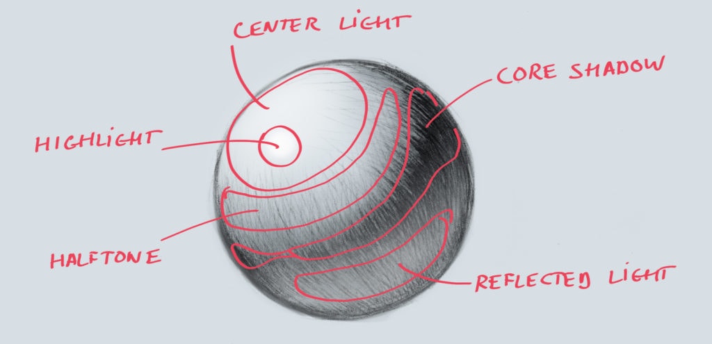
Core Shadows: The darkest areas on your subject, parts that receive no direct light. These appear on the side facing away from your light source.
Cast Shadows: Created when your object blocks light from hitting another surface. They’re darkest closest to the object and get lighter as they stretch away.
Need more foundational knowledge? Check out our guide on what is digital art to understand the basics.
Part 3: How to Shade Digital Art (Step-by-Step)

Step 1: Create a Shading Layer
Create a new layer above your base colors. Set this layer to “Multiply” blend mode, it darkens whatever is underneath, making it perfect for shadows.
You can also try:
- Overlay for softer shadows
- Normal mode with reduced opacity for full control
Step 2: Pick Your Shadow Color

You don’t need to use pure black! Some shadow colors:
- Add a hint of blue or purple (cooler tones)
- Slightly desaturate compared to your base
- Consider the environment
For example, if you’re shading a yellow object, try a dark orange rather than dark yellow.
Step 3: Block In Your Shadows
Using a soft brush, paint in where your shadows will go. Ask yourself:
- Where is my light NOT hitting?
- What parts are furthest from the light?
- What objects are casting shadows on other objects?
Don’t worry about blending yet, just block in the general areas.
Step 4: Add Your Highlights
Create another new layer, set to “Add” or “Screen” blend mode for glowing highlights.
Highlights go on:
- Surfaces facing directly toward the light
- Rounded edges catching light
- Reflective materials (metal, glass, wet surfaces)
Use a color slightly lighter and more saturated than your base. Shift the hue slightly toward your light color (warm yellows for sunlight, cool blues for overcast).
Step 5: Blend and Refine

Now comes the magic:
Soft Brush Method: Lower your brush opacity to 20-40% and gently paint between shadows and mid-tones, creating smooth gradients.
Smudge Tool: Push colors into each other. Great for skin, fabric, and organic surfaces.
Texture Brushes: Add realism with textured brushes that break up overly-smooth gradients.
Work gradually, it’s easier to add more shading than to remove it.
Step 6: Add Reflected Light
Reflected light is subtle illumination that bounces back into shadowed areas from nearby surfaces. It’s what separates good shading from great shading.
Add it on a new layer with low opacity. If your character is standing on green grass, add subtle green reflected light into the bottom shadows.
Step 7: Final Adjustments

Zoom out and check:
- Is your light source consistent everywhere?
- Do the colors work together harmoniously?
- Do the shadows feel too heavy or too light?
- Does the shading support the focal point?
Use adjustment layers (Curves, Brightness/Contrast) to tweak without destroying your work.
Looking for the right tools? Read our guide on best digital art apps to find a software with powerful coloring and shading features.
Common Mistakes to Avoid
Using Pure Black for Shadows: Sometimes it creates a lifeless shadows. To make your art seem more colorful you can use dark colors with some hue, dark blues, purples, or browns.
Ignoring Color Temperature: Shadows are usually cooler. Highlights are usually warmer (or vice versa depending on your light source).
Inconsistent Light Direction: Shadows pointing different directions destroy believability instantly.
Different Shading Techniques

Soft Shading
Creates smooth gradients for a realistic, painterly look.
- Use many subtle value and color shifts
- Blend extensively between tones
- Takes more time but creates realistic depth
Cel Shading
Uses distinct areas of flat color with hard edges. Common in anime and comics.
- Use 2-3 distinct value levels (base, shadow, highlight)
- Keep edges mostly hard with minimal blending
- Works great for graphic, punchy artwork
Share your colored and shaded artwork! Tag us @kickersketch on Instagram or Facebook, we love seeing what you create!
Practice Exercises

The Sphere Challenge: Draw and shade a perfect sphere with different colors and light angles. This teaches you gradients, shadows, highlights, and how color affects form.
Everyday Objects: Choose simple colored objects (a red apple, blue mug, yellow book) and draw them from observation.
Color Study from Masters: Find artwork with color schemes you love and try to recreate the palette.
30-Day Challenge: Create and shade something with a new color scheme every day for 30 days.
Your Turn!
Start with simple color palettes, focus on one light source, and don’t be afraid to make mistakes. Every shadow you add and every color choice you make teaches you something new, so enjoy the learning process!
Now grab your stylus, open your art app, and start practicing.
Love digital art content? Follow our community on Instagram and Facebook @kickersketch for artist spotlights.
Stay in the Loop!
Get updates on new drops, restocks, and exclusive deals delivered straight to your inbox!